2 - Configuration Menu
Edit panel
The edit panel is the panel allowing the user to change parameters on the current configuration. The parameters can have multiple types, as you can see in the general documentation about parameters, 🔗
Those types are displayed in the edit panel in the following manner:
Boolean values
Number range

Buttons
Buttons can be displayed for string values or discrete number values.

Colors
Colors are displayed using there hexadecimal values in small squares.

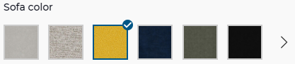
Product lists
By default, product lists are displayed in small card.

When all the possibles values of the parameters are material, they are displayed as a Material List 🔗
Material lists
When all the products from a product list are materials, they are displayed in a different way:
Products or material big lists
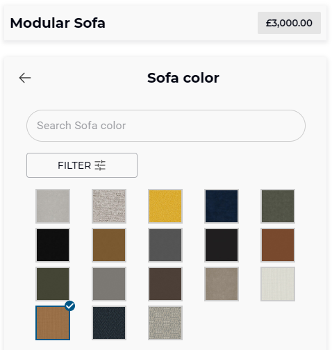
When there is not enough place to display all the products ("classic" products or materials list), a button is displayed to allow the user to see more of them.
When the user clicks on it, the list is opened in a bigger view with a scroll.
On desktop, some text filtering can be used:
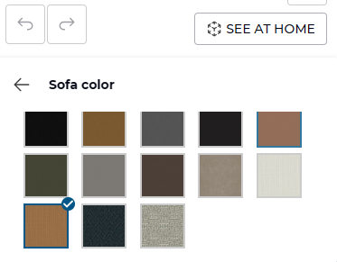
On mobile there is no filtering option. There is only a list of products:
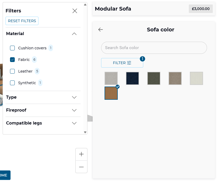
Filters
When the conditions are met, a button can be displayed to filter a list of products:
- Filters are configured 🔗.
- A full list of products is displayed 🔗.
- The data for filters is filled in the products displayed in the list, and at least one filter has two possible values.
On desktop only, a "Filter" button is displayed. It allows the user to open the list of available filters, and to filter the list of available products using the checkboxes.
Modular products
When you load a modular product, 🔗 you will need to interact with the 3D viewer to select modules or anchors for example.
This is only available for modular product.
Modules list
When nothing is selected in the 3D viewer, you can find the list of modules currently loaded at the bottom of the configuration menu.
You can click on a module in this list to configure it. It will also be selected in the 3D viewer.
This list should be sorted from left to right (left module, first, right module last). If you want this to work, you have to configure the anchors according to the documentation. 🔗
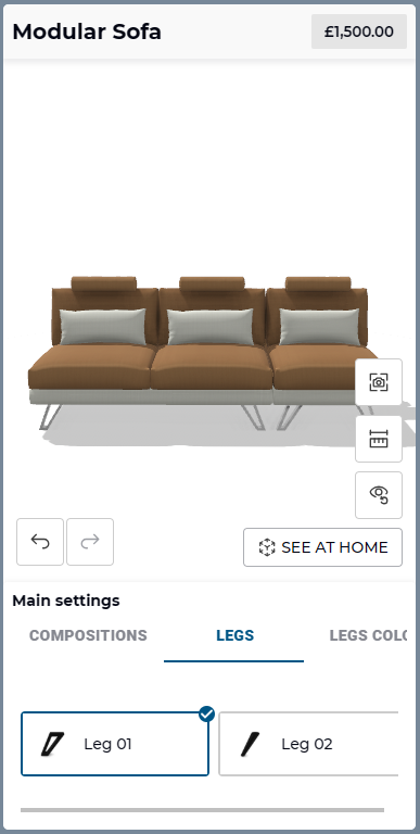
When the product configurator is displayed on mobile, the list of modules is not displayed. This is intentional to save some space:
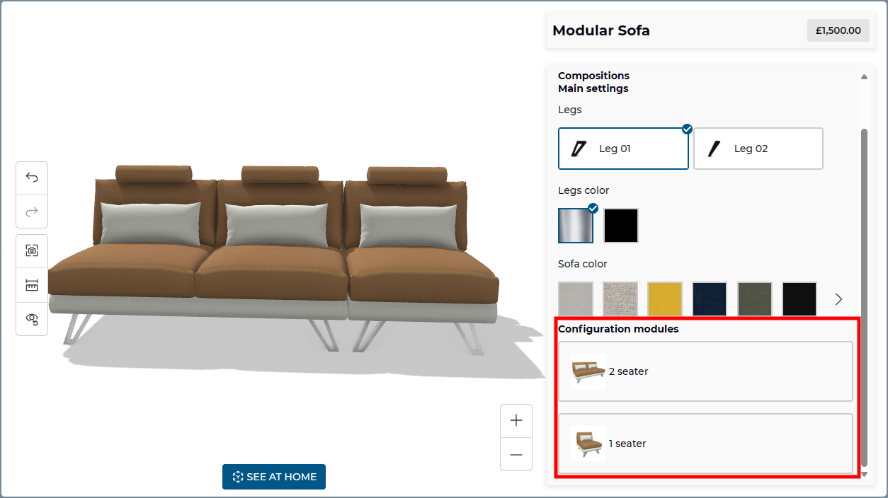
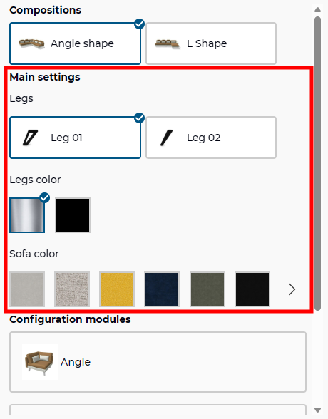
Global parameters
When you configure a module product, you may have some global parameters available. You will find them at the top of the configuration menu when no module is selected.
Selecting a value in one of the global parameters will apply it on all compatible modules currently loaded.
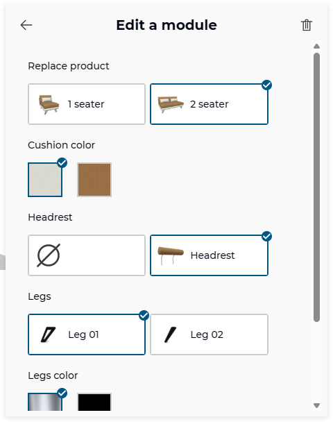
Local parameters
When you select one of the loaded modules, the menu will display parameters that have an impact on the selected module only. This is also where you can replace the selected module by another one. Only compatible modules will be displayed in this list.
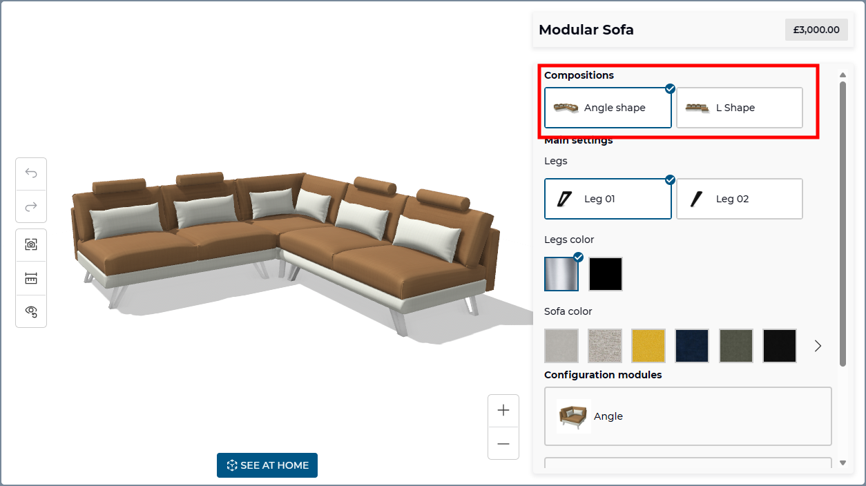
Compositions
When compositions are available, you will find them at the top of the configuration menu, when no module is selected. They are similar to product lists. 🔗