3 - Configurator Integration
How to configure the Product Configurator
They are two ways of configuring the way the Product Configurator is displayed:
- Using the Application Distribution "integration" parameter. 🔗
- If necessary from a developer side when using the standalone Product Configurator, you can use DOM attributes. 🔗
User Interface
This first attribute has some big impact. It chooses if the global User Interface of the configurator is displayed. Only disable this if you want to build your own menus on your website.
The other attributes on this page are sorted in two lists:
- The attributes that can be useful with or without the user interface. 🔗
- The attributes that are only useful if you keep the user interface. 🔗
If you use the Product Configurator inside the planner, disabling the UI in the application distribution is probably not a good idea. It will hide the menus inside the planner.
| Application Distribution | [Dev] DOM attribute | Possible values | Default value |
|---|---|---|---|
userInterface | data-user-interface | Boolean | true |
Application Distribution example:
{
  "integration": {
    "userInterface": true
  }
}
HTML attribute example:
<product-configurator data-user-interface="true">
</product-configurator>
Attributes
Camera settings
Manages the behavior of the 3D camera through which the scene is rendered.
| Application Distribution | [Dev] DOM attribute | Possible values | Default value |
|---|---|---|---|
camera | data-camera | A JSON object with multiple parameters. | See the next table. |
List of camera parameters
This is the list of parameters that can be added inside the camera JSON parameter.
| Parameter name | Possible values | Default value |
|---|---|---|
animationDuration | [integer] - The duration of the camera animations, in milliseconds. There will be no animation if the value is set to zero. | 1000 |
defaultDistance | [number] - The default distance at which the camera should be positionned, with regards to the scene size. | 1.3 |
defaultHorizontalAngle | [integer] - The default camera horizontal angle, ranging between 0 and 360 degrees. | 0 |
defaultVerticalAngle | [integer] - The default camera vertical angle, ranging between 5 and 90 degrees. | 15 |
minDistance | [number] - The minimum distance at which the camera can move, with regards to the scene size. | 0.5 |
maxDistance | [number] - The maximum distance at which the camera can move, with regards to the scene size. | 3 |
startupAnimationDuration | [integer] - The duration of the first camera animation, in milliseconds. There will be no animation if the value is set to zero. | 3000 |
Application Distribution example:
{
  "integration": {
    "camera": {
      "defaultDistance": "1.1",
      "defaultHorizontalAngle": "90"
    }
  }
}
HTML attribute example:
<product-configurator data-camera='{"defaultDistance": "1.1", "defaultHorizontalAngle": "90"}'>
</product-configurator>
Locale Name
This is the language used by the Product Configurator. The value to use here is one of the name of the locales you configured in the Application Distribution. 🔗
| Application Distribution | [Dev] DOM attribute | Possible values | Default value |
|---|---|---|---|
localeName | data-locale-name | One of the name of the locales you configured in the Application Distribution. 🔗 | "" |
Application Distribution example:
{
  "integration": {
    "localeName": "fr-FR"
  }
}
HTML attribute example:
<product-configurator data-locale-name="fr-FR">
</product-configurator>
Palette settings
Defines the colors palette to be used by the application
| Application Distribution | [Dev] DOM attribute | Possible values | Default value |
|---|---|---|---|
palette | data-palette | A JSON object with multiple parameters. | See the next table. |
List of palette parameters
This is the list of parameters that can be added inside the palette JSON parameter.
The color values are hexadecimal values. Colors having no default value are automatically computed from the primary color. You can start by modifying the primary and secondary color, and only change the other ones if necessary.
| Parameter name | Possible values | Default value |
|---|---|---|
primary | The application primary color. | "#005686" |
lightPrimary | A lighter variation of the application primary color. | Computed from primary |
darkPrimary | A darker variation of the application primary color. | Computed from primary |
contrast | The contrast color matching the application primary color, generally white for dark primary colors or black for light primary colors. | Computed from primary |
borderContrast | The color matching the contrast color but darker or lighter, for border next to the contrast color for instance. | Computed from contrast |
secondary | The application secondary color. Choose a color that can be displayed on a light background, the contrast color is not always displayed behind items using the secondary color. | "#3d3d3d" |
secondaryContrast | The contrast color matching the application secondary color, generally white for dark secondary colors or black for light secondary colors. | Computed from secondary |
secondaryBorderContrast | The color matching the secondary contrast color but darker or lighter, for border next to the contrast color for instance. | Computed from secondaryContrast |
Application Distribution example:
{
  "integration": {
    "palette": {
      "primary": "#de0000",
      "secondary": "#073d94"
    }
  }
}
HTML attribute example:
<product-configurator data-palette='{"primary": "#de0000", "secondary": "#073d94"}'>
</product-configurator>
Screenshots
The screenshots below show examples of color changes with a red color so it's highly visible.
Red primary color
Red secondary color
Rendering settings
Defines the rendering options to be used by the application.
| Application Distribution | [Dev] DOM attribute | Possible values | Default value |
|---|---|---|---|
rendering | data-rendering | A JSON object with multiple parameters. | See the next table. |
List of rendering parameters
This is the list of parameters that can be added inside the rendering JSON parameter.
| Parameter name | Possible values | Default value - |
|---|---|---|
environmentMap | [string] - Defines the environment map used for the scene illumination. It can be one of the following values : BASIC_ROOM, PHOTO_STUDIO. | "PHOTO_STUDIO" |
groundShadow | [boolean] - Defines if the ground shadow is displayed, or not. The ground shadow makes the product more tangible. | true |
Environment maps
The following images illustrate the visual impact of selecting a specific environment map on application rendering.
| BASIC_ROOM | PHOTO_STUDIO |
|---|---|
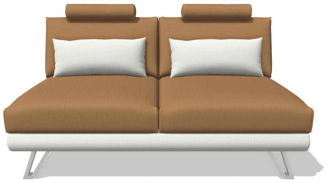 | 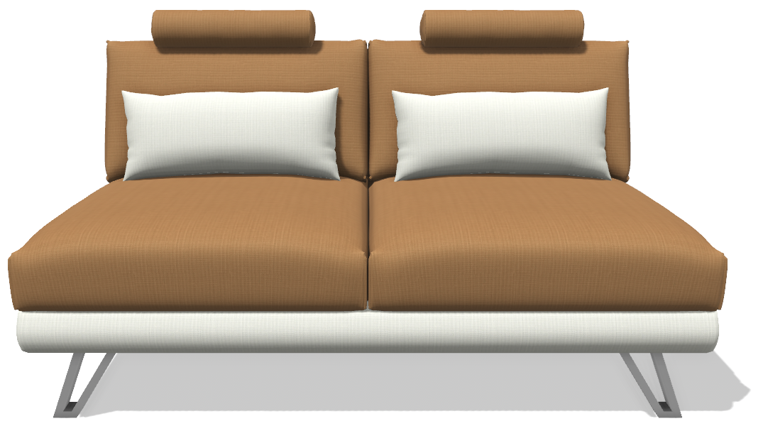 |
Application Distribution example:
{
  "integration": {
    "rendering": {
      "environmentMap": "BASIC_ROOM",
      "groundShadow": false
    }
  }
}
HTML attribute example:
<product-configurator data-rendering='{"environmentMap": "BASIC_ROOM", "groundShadow": "false"}'>
</product-configurator>
Screenshot resolution
This is the resolution of the screenshots taken by the configurator.
| Application Distribution | [Dev] DOM attribute | Possible values | Default value |
|---|---|---|---|
screenshotResolution | data-screenshot-resolution | "CANVAS": Captured at the canvas resolution. "SQUARE-512": Captured at a 512x512 pixels resolution. "SQUARE-1024": Captured at a 1024x1024 pixels resolution. | "SQUARE-1024" |
Application Distribution example:
{
  "integration": {
    "screenshotResolution": "SQUARE-512"
  }
}
HTML attribute example:
<product-configurator data-screenshot-resolution="SQUARE-512">
</product-configurator>
UI widgets
Manages the widgets in the UI.
| Application Distribution | [Dev] DOM attribute | Possible values | Default value |
|---|---|---|---|
widgets | data-widgets | A JSON object with multiple parameters. | See the next table. |
List of widgets parameters
This is the list of parameters that can be added inside the widgets JSON parameter.
| Parameter name | Possible values | Default value |
|---|---|---|
modularOnboarding | [boolean] - Display or not the onboarding message after the first loading of a modular element. The goal of this message is to make sure the user knows the products can be selected. | true |
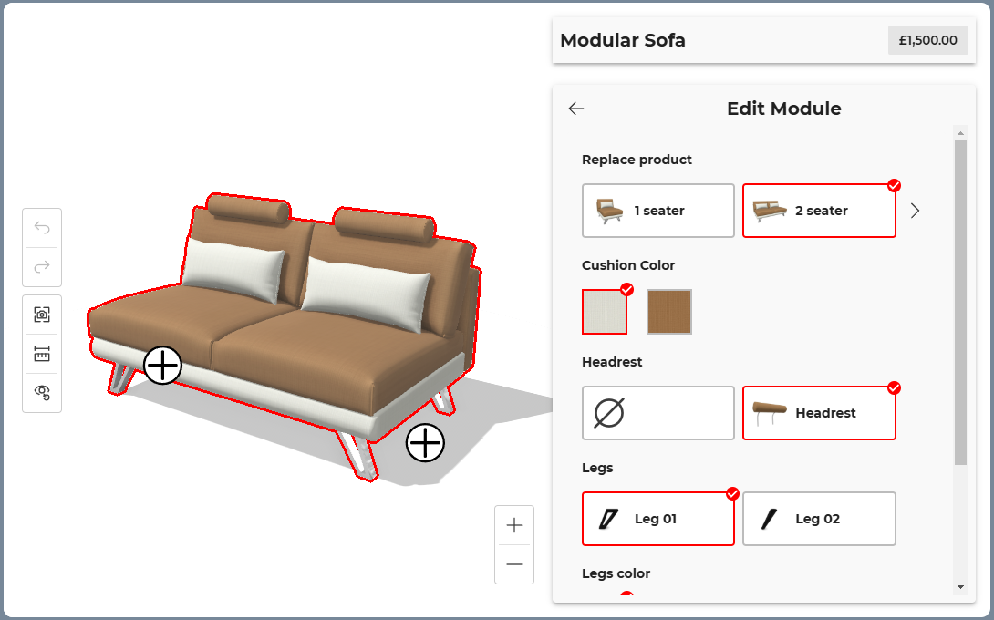
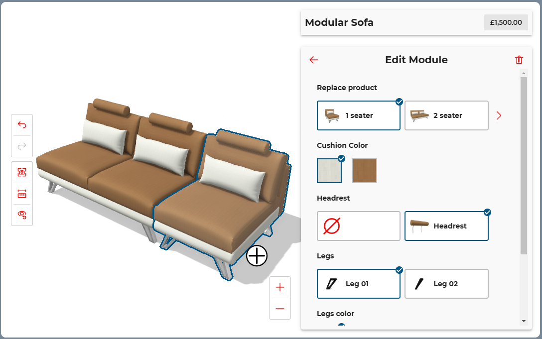
modularDeletionButton | [boolean] - Display or not the deletion button 🔗 on selection of a deletable modular element. The module will still be deletable in the menu even if the button is hidden. | true |
Application Distribution example:
{
  "integration": {
    "widgets": {
      "modularOnboarding": false,
      "modularDeletionButton": false
    }
  }
}
HTML attribute example:
<product-configurator data-widgets='{"modularOnboarding": "false", "modularDeletionButton": "false"}'>
</product-configurator>
Attributes (with UI enabled only)
Commands (Desktop and mobile)
The product configurator comes with a set of commands. Each command can be disabled if necessary.
You can modify this "commands" attribute to modify the enabled commands on desktop. If you do not set the "commandsMobile" attribute, the "commands" attribute will be applied on both desktop and mobile. If you set the "commandsMobile" attribute, the "commands" attribute will be used for desktop view only.
Commands
| Application Distribution | [Dev] DOM attribute | Possible values | Default value |
|---|---|---|---|
commands | data-commands | A JSON object with the value for each command. | See the list of commands below. |
Commands (mobile)
| Application Distribution | [Dev] DOM attribute | Possible values | Default value |
|---|---|---|---|
commandsMobile | data-commands-mobile | A JSON object with the value for each command. | See the list of commands below. |
List of commands and their values
All commands are enabled by default. Be careful: some commands are only available on desktop.
| Command name | Desktop default value | Mobile default value |
|---|---|---|
ar | true | true |
dimensions | true | true |
resetView | true | true |
screenshot | true | true |
undoRedo | true | true |
zoom | true | NOT AVAILABLE |
Application Distribution example:
{
  "integration": {
    "commands": {
      "resetView": "false",
      "screenshot": "false"
    },
    "commandsMobile": {
      "ar": "false"
    }
  }
}
HTML attribute example:
<product-configurator data-commands='{"resetView": "false", "screenshot": "false"}'
                      data-commands-mobile='{"ar": "false"}'>
</product-configurator>
Iconography settings
Defines the icons and images to be used by the application.
| Application Distribution | [Dev] DOM attribute | Possible values | Default value |
|---|---|---|---|
iconography | data-iconography | A JSON object with multiple parameters. | See the next table. |
List of iconography parameters
This is the list of parameters that can be added inside the iconography JSON parameter.
You can use base64 images or public urls.
| Parameter name | Possible values | Default value |
|---|---|---|
splashLogo | The image to display as main logo in the application loading screen. When you use the planner integration, this logo is also displayed in the planner header. 🔗 | HomeByMe logo. |
splashSpinner | The image to display as secondary logo in the application loading screen. | Spinning circle animation. |
The loader of the product configurator is displayed as soon as possible. For this reason and to avoid the flashing of content, there are some limitations:
splashLogo
- In most cases, this will be displayed after a short time (once the connection is established).
- If you use the standalone product, you can set it as a "DOM" attribute (for developers only). In this case it will be displayed immediately.
splashSpinner
- This is only taken into account on the standalone product configurator if you set it as a "DOM" attribute (for developers only).
- If you do not use the standalone product configurator, or it you try to set it in your application distribution, it will not be displayed.
Application Distribution example:
{
  "integration": {
    "iconography": {
      "splashLogo": "https://your.domain/your_logo.png"
    }
  }
}
HTML attribute example:
<product-configurator data-iconography='{"splashLogo": "https://your.domain/your_logo.png"}'>
</product-configurator>
Menu Position
The interface of the configurator can display the configuration menu on the right, or on the left of the 3D model.
| Application Distribution | [Dev] DOM attribute | Possible values | Default value |
|---|---|---|---|
menuPosition | data-menu-position | "LEFT": The menu is on the left. "RIGHT": The menu is on the right. | "RIGHT" |
Application Distribution example:
{
  "integration": {
    "menuPosition": "LEFT"
  }
}
HTML attribute example:
<product-configurator data-menu-position="LEFT">
</product-configurator>
Project bar
The project bar is displayed above the configuration menu, and can contain information or actions on the current configuration.
See the user guide for screenshots. 🔗
The project bar is always disabled when the configurator is used inside the planner.
| Application Distribution | [Dev] DOM attribute | Possible values | Default value |
|---|---|---|---|
projectBarMode | data-project-bar-mode | "NONE": The project bar is not displayed. "BASIC_INFO": The project bar displays the product name and price. "BASIC_INFO_WITH_BUTTON": The project bar displays the product name and price, as well as an action button. | "BASIC_INFO" |
Application Distribution example:
{
  "integration": {
    "projectBarMode": "NONE"
  }
}
HTML attribute example:
<product-configurator data-project-bar-mode="NONE">
</product-configurator>
Typography settings
Defines the fonts and associated data to be used by the application.
| Application Distribution | [Dev] DOM attribute | Possible values | Default value |
|---|---|---|---|
typography | data-typography | A JSON object with multiple parameters. | See the next table. |
List of typography parameters
This is the list of parameters that can be added inside the typography JSON parameter.
| Parameter name | Possible values | Default value |
|---|---|---|
family | [string] - The prioritized list of font family names to use in the application. | ""Montserrat", Helvetica, Arial, sans-serif" |
sizeRatio | [number] - The size ratio applied on the fonts displayed in the application. A ratio of 1 means no size change, 1.5 means fonts are displayed 50% bigger, whereas 0.5 means fonts are displayed 50% smaller. The ratio value is in the [0.5; 2.0] range. | 1 |
Application Distribution example:
{
  "integration": {
    "typography": {
      "family": "Consolas"
    }
  }
}
HTML attribute example:
<product-configurator data-typography='{"family": "Consolas"}'>
</product-configurator>